
Facebook Group cover photos can be one of the trickiest parts of optimizing your group.
What’s the correct Facebook Group cover photo size? Is this the same size when it’s viewed on both desktop and mobile? What’s the best text to image ratio to include in your cover? What’s the easiest way to actually make one which looks beautiful and professional, and doesn’t look painfully DIY?
With 15 Facebook Groups, we’ve got quite a lot of experience at creating unique and interesting Facebook Group covers, so we’re here to help! Everything you need to know can be found in this article.
Jump to: Creating a cover I Best photo size I What to include in the design I How to add I Cover photo FAQ
What is a Facebook Group Cover
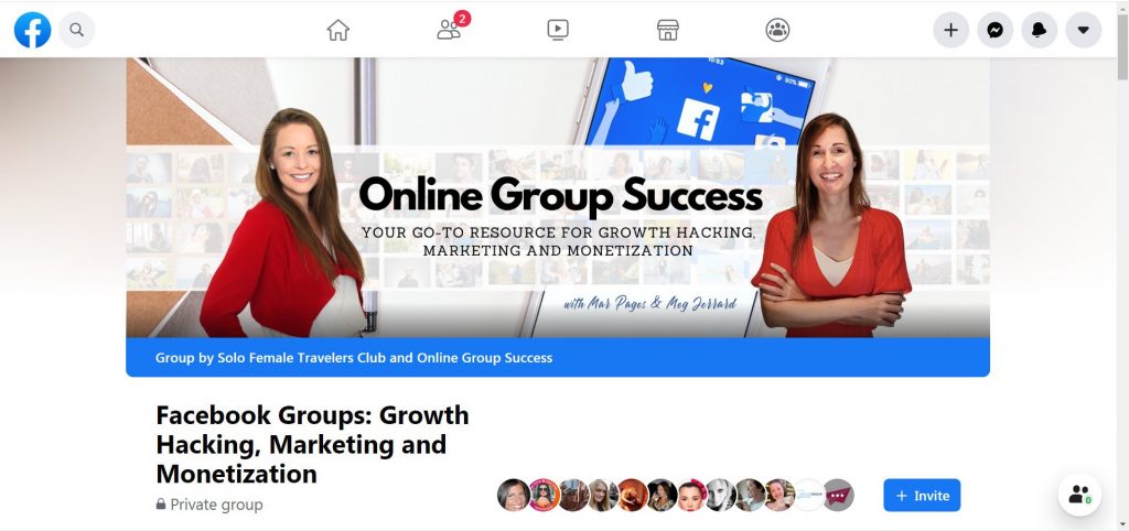
Your Facebook Group cover photo appears at the very top of the group. This is the first thing any of the nearly 2 billion Facebook users will see when they enter your group, and, along with your group’s name and URL, it is one of the few publicly visible features of a private group, allowing someone to form an impression of the group and decide if they want to join you.
Think of your cover photo as your virtual shop window. It’s prime real estate for drawing people in and defining your group personality and with millions of Facebook Groups out there and a 2020 boost in membership, standing out and catching people’s attention is key. So don’t let this opportunity go to waste.
It can be very tempting to take the quick, easy route here, by throwing up an image which generally relates to your topic “just to fill the space”. But your cover photo can have a very big impact because of how prominently it is displayed.
Just as catchy shop windows have the power to make you walk in, so does a cover photo when a member is hovering over the join button. So put some time into creating a graphic which combines both text and imagery to catch your members’ attention, strengthen your brand positioning, and maybe even promote any current projects, events, promos, or offers.
How to Create a Facebook Group Cover

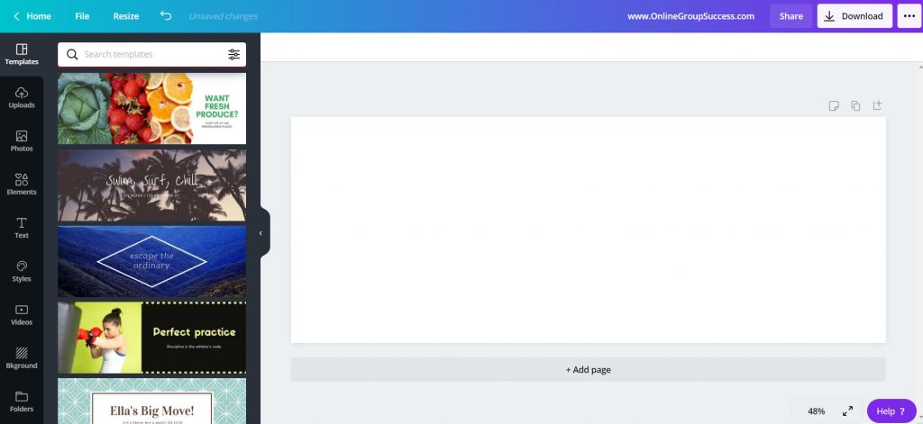
The easiest way to create a Cover Photo is in Canva, which is a free drag and drop graphics design tool for beginners, and has a fully loaded library of Facebook Cover templates you can use to create something fancy without too much effort.
Facebook group cover photo size
Facebook officially recommends sizing your group cover photos to 1,640px by 856px (or 1.91:1 ratio). However we personally find this is a bad size as it’s too tall, and you’re forced to cut half of the image.
We instead recommend using the dimensions 2050 px x 780 px for your whole design to display properly.
No idea what those dimensions mean? Jump into Canva and on your home screen where there are a wide range of pre-set designs there for you.
Click on the Social Media filter, and then choose to create a Facebook cover. The optimal dimensions will automatically generate, and a new window will open with a blank canvas for you to start designing.
Learn Our Secrets to Growing 15 Groups to 100k + Members! Get Our E-Book!
400 + Actionable Pages
390 + How-to Screenshots
32 Proven Unpaid Growth Strategies
My group has exploded using your strategies. A competing group actually asked me how I was growing so quickly!!

Things to know before you start designing your Facebook Group cover photo
Using the features in the left hand sidebar, you can start creating a cover photo from scratch, by adding text, elements, graphics etc. Or, you can use their Facebook cover templates (as seen above to the left) as a base from which you can build upon, or simply use a template without much customization at all.
Canva is free, though there’s a premium upgrade with extra perks like access to millions of stock photos, ability to upload your own fonts, and capacity to work as a large team. But the free version offers plenty of generous functionality, so a premium account isn’t needed for designing a cover photo.
When designing your cover, you’ll need to make sure your design is in line with Facebook Community Standards, which includes making sure it is not deceptive, misleading or infringes anyone’s copyright.
You should also bear in mind that on mobile, your cover image will be chopped off on the sides, so it’s important to keep important text and imagery away from the borders, after all, the vast majority of Facebook users are on mobile. You can reposition the image on mobile to choose which side you want to be chopped off on mobile. Simply go to your group on mobile and click to edit and reposition the image by dragging it.
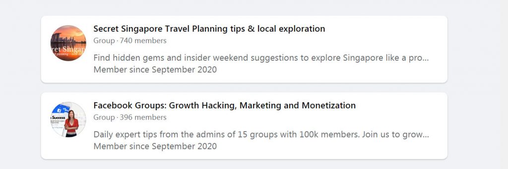
As mentioned before, your cover image is one of the things potential new members will see when they search for groups to join, though when viewed in Facebook Search, the image appears as a small circle and only displays a part of your cover.
By default, the circle shows the center of your cover image (so place the most important elements of your cover image in the center), but if there is a face on your cover the circle will reposition to focus on that, even if it is not in the middle.
The below screenshots are for the groups Secret Singapore Travel Planning, for which the Cover does not include a person and the search circle defaults to the center of the image, and Facebook Groups: Growth Hacking, Marketing, and Monetization, for which the search circle centers around Mar, despite her being positioned to the far right of the full image.
What to include in your cover
Your cover photo should be relevant to your group and tell members what you’re about in the same way that a group name does. You’re offering a visual into your group’s personality and values, and since we’re going with the metaphor of a shop window, you should treat your cover as such. Make sure it represents what people will get from joining.
This is an opportunity to be creative, and most covers include a combination of an image along with text and graphic design elements. Though it’s important not to include any low quality image – you should pick one which is high quality, high resolution, and if possible, something that can elicit an emotional connection from your ideal members.
Avoid generic stock images which are available for everyone-else to use – the whole point of a cover image is to make your group stand out, and make it memorable.
Your cover should be consistent with your brand identity, so do include the same style of images, fonts and colors you use throughout your overall branding. Though keep it as simple as possible. You should include a clear focal point which makes your text stand out, remembering that the simplest designs are often the most impactful.
Don’t be afraid to use negative / empty space to make your text really pop. When there is too much clutter, your message can often get lost.
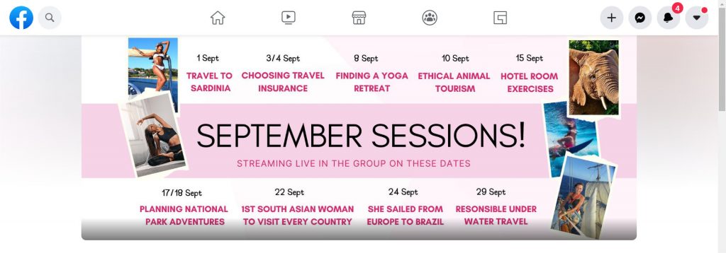
While most Facebook covers will include the group name and tagline, which is our default in Solo Female Travelers, we also rotate seasonal covers, which tells non-members that the group is active and current (e.g. we may include Christmas elements or specific graphics come November), and we often use the real estate to promote upcoming events and current offers, as you see in the below example which promotes a line up of live webinars we have in the group that month.
How to add / change your cover photo
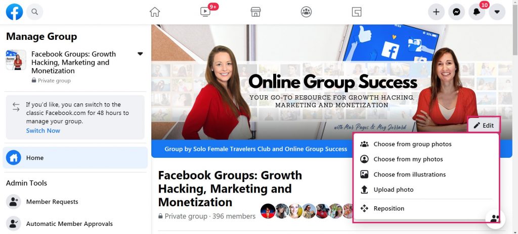
When viewing your group, there will be an Edit button in the bottom right hand corner of the current cover (if you’ve started a new group, this button is in the same spot).
Click this, and you’ll have the option to upload a cover from your group photos, from your personal Facebook photos, from illustrations, or to upload an image from your computer.
Once your cover is placed, you’ll have the option to reposition the placement, and can then click Save changes to publish.
You will be able to reposition your image on mobile separately from desktop by simply going into your group from your mobile device and clicking to reposition the cover image.
Can We Help With Your Facebook Group Cover Photo?
With 15 Facebook Groups, many of which often rotate seasonal cover photos, we have a lot of design experience in creating Facebook Group covers, and optimizing them for achieving specific purposes.
Are you struggling with your Facebook Group cover design? We’d love to help!
- We have a FREE hour long Canva training exclusively in our Facebook Group for group admins. Click here to watch this session.
- Share your Facebook cover photo in our Facebook group to get advice from other expert group admins. We’ll give you our feedback too!
Learn Our Secrets to Growing 15 Groups to 100k + Members! Get Our E-Book!
400 + Actionable Pages
390 + How-to Screenshots
32 Proven Unpaid Growth Strategies
My group has exploded using your strategies. A competing group actually asked me how I was growing so quickly!!

FAQ on Facebook Group Cover Photo
The best Facebook Group cover photo size is 2050 px x 780 px for your whole design to display properly. Bear in mind that on mobile, your cover image will be chopped off on the sides, so it’s important to keep important text and imagery away from the borders.
The easiest way to create a cover photo is in Canva, which is a free drag and drop graphics design tool for beginners, and has a fully loaded library of Facebook Cover templates you can use to create something fancy without too much effort.
Create it in Canva using the size / dimensions 2050 px x 780 px.
When viewing your group, there will be an Edit button in the bottom right hand corner of the current cover (if you’ve started a new group, this button is in the same spot). Click this, and you’ll have the option to upload a cover from your group photos, from your personal Facebook photos, from illustrations, or to upload an image from your computer.
Once your Facebook Group cover photo has been created, you can then reposition your image on mobile separately from desktop by simply going into your group from your mobile device and clicking to reposition the cover image.
No. When you change, add, or update a group cover photo, Facebook publishes a notification to the group feed that you have changed the cover. If you delete this from the group feed, it deletes the cover image. You cannot change the cover photo without everyone knowing.

